
Step 2: Start Using AngularDart Components 1.0
In this step, you’ll change the app to use a few of the AngularDart Components:
<material-icon><material-progress><acx-scorecard>
Run the live example (view source) of the `` version of the app.
Copy the source code
Make a copy of the base app’s source code:
> cp -r 1-base myapp
> cd myapp
> pub get
From now on, you’ll work in this copy of the source code, using whatever Dart web development tools you prefer.
Depend on angular_components
-
Edit
pubspec.yamlto add a dependency toangular_components: -
Get the new package:
> pub get
Set up the root component’s Dart file
Edit lib/lottery_simulator.dart,
importing the Angular components and informing Angular about
materialProviders
and the material directives used in the template:
Now you’re ready to use the components.
Use material-progress
Edit the template file lib/lottery_simulator.html to use the
<material-progress> tag
(MaterialProgressComponent).
The diffs should look similar to this:
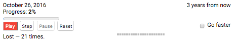
Run the app, and you’ll see the new progress bar stretching across the window:
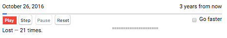
As a reminder, here’s what the progress section looked like before:
That change is barely noticeable. You can make a bigger difference by adding
images to the buttons, using the <material-icon> component.
Use material-icon in buttons
Using <material-icon>
(MaterialIconComponent)
is similar to using <material-progress>,
except that you also need
material icon fonts.
You can find icons and instructions for including them at
design.google.com/icons.
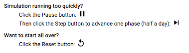
Use the following icons in the main simulator UI:
| Current button text | New icon | Icon name |
|---|---|---|
| Play |  |
play arrow |
| Step |  |
skip next |
| Pause |  |
pause |
| Reset |  |
replay |
-
Find the icon font value for play arrow:
- Go to design.google.com/icons.
- Enter play or play arrow in the site search box.
- In the results, click the play arrow icon
to get more information.
- Click ICON FONT to get the icon code to use: play_arrow.
-
Find the icon font values for skip next, pause, and replay.
-
Edit the main HTML file (
web/index.html) to add the following code to the<head>section: -
Edit
lib/lottery_simulator.htmlto change the first button to use a<material-icon>instead of text:- Add an
aria-labelattribute to the button, giving it the value of the button’s text (Play). - Replace the button’s text (Play) with a
<material-icon>element. - Set the
iconattribute to the icon code (play_arrow).
Here are the diffs:
- Add an
-
Use similar changes to convert the Step, Pause, and Reset buttons to use material icons instead of text.
These small changes make a big difference in the UI:
Use material-icon in other components
If you scroll down to the Tips section of the page, you’ll see blank spaces where there should be icons:
The HTML template (lib/src/help/help.html) uses <material-icon> already, so why isn’t it working?
Edit lib/src/help/help.dart to import the AngularDart Components and
register MaterialIconComponent.
Adding those two lines to lib/src/help/help.dart makes the material icons display:
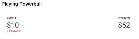
Use acx-scorecard
Make one more change: use
<acx-scorecard> (ScorecardComponent)
to display the betting and investing results. You’ll use the
scorecards in the app’s custom ScoresComponent (<scores-component>), which is
implemented in lib/src/scores/scores.*.
-
Edit
lib/src/scores/scores.dartto registerScorecardComponentand thematerialProvidersprovider: -
Edit
lib/src/scores/scores.html(the template file forScoresComponent) to change the Betting section from a<div>to an<acx-scorecard>. Specify the following attributes (documented in theScorecardComponentAPI reference) for each<acx-scoreboard>:-
label:Set this to the string in the div’s<h4>heading: “Betting”. -
class:Set this to “betting”, so that you can use it to specify custom styles. -
value:Set this to the value of thecashproperty ofScoresComponent. -
description:Set this to the second line of content in the div’s<p>section. -
changeType:Set this to the value that[class]is set to, surrounded by{{ }}.
-
-
Similarly, change the Investing section from a
<div>to an<acx-scorecard>. A few notes:-
label:Set this to “Investing”. -
class:Set this to “investing”. -
value:Set this to the value of thealtCashproperty ofScoresComponent. -
description:As before, set this to the second line of content in the div’s<p>section. -
Don’t specify a
changeTypeattribute.
Here are the code diffs for the last two steps:
-
-
Edit
lib/src/scores/scores.css(styles forScoresComponent) to specify that.investingfloats to the right. You can also remove the unneeded.positiveand.negativestyles. -
Refresh the app, and look at the nice new UI:
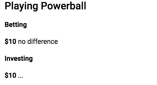
Remember, it used to look like this:
Problems?
Check your code against the solution in the 2-starteasy directory.